| It took a while. I thought everything was just fine, and when I got my proof copy I discovered that the page numbers at the top had been lopped off and the text crowded against the top of the page. That won't do! So back to the page design section of Kindle Diirect Publishing. This time I took special care with the top margin, and when I got my proof copy I was happe enough and hit the PUBLISH button. Now before you report to me the typo on the back cover and another one in the description on Amazon (and I assume other book sites), be assured that I am too well aware of them already. I will correct them eventually. I find that I need to step back from this project for now and worry about other things. Eventually I will examine the entire book with a careful eye for any additional problems that I would like to correct and will handle matters after I make my list. |
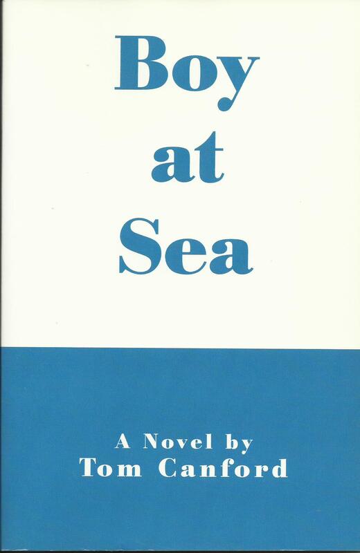
| A few people have complimented me on cover design. At first I was thinking about the design I came up for my late friend Tom's novel Boy at Sea, but with black and white instead of blue and white. But the more I thought about it I began to think of that design as too stark for this work and in fact contrafy to the basic theme. I searched about in the cover design section on Kindle Direct Publishing and found the one I used. The bsic design was set and wraps around to the back, but if memory serves I was able to adjust color. KDP does provide a wide and wonderful wonderful array poissibilities, some of which you can adjust more than others. Below I'll post convers of my 2 novels to show you how the same design can be adjusted while keeping a basic design for the whole body of work. (Can you consider 2 a body of work?) I did something similar for 2 of my non-fiction works, as you will see below that. |
Of the 2 non-fiction works below, Rants, Raves . . . has been removed from publication because family information incluided has been superseded by later and more accurate facts. The other one is still available, although I am using 2 sections from it, one about the Sutpens and one about the 2 Sokurov movies, in a new work now in progress (don't worry: I got permission from the author).
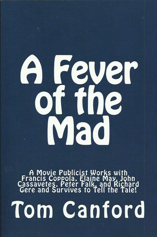
| When after his death I published Tom's memoir about working as a movie publicist, I thought that with the long subtitle I needed a very plain cover with slightly fancing writing in white. I did want those names to show up and not get lost in the design. I'm pleased enough with what I came up with. Incidentally, the chapter dealing with his excperiences working on Elaine May's Mikey and Nicky has been optioned for a movie by a young producet/actor/writer/director. (Ellaine is no kin to me, in case you were curious.) If that comes to fruition maybe I'll add some sort of movie-tie-in banner to the design or maybe use elements from the movie ads. I'm not borrowing money on the prospect, however. |


 RSS Feed