| Revisiting Siren Song My final version of “Siren Song” is now up and running on Amazon. Just this morning I got the Paperback and Kindle listings merged: https://www.amazon.com/s/ref=nb_sb_noss_1?url=search-alias%3Dstripbooks&field-keywords=jonathan+siren (For my own taste the new cover looks better, especially in the smaller thumbnail.) Why revisit a third time, you might well ask. Or not. | 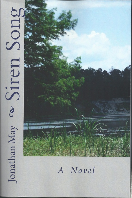 |
Version 2 was primarily an attempt to clear up a formatting problem that led to right and left margins being too large: that had resulted from my initial inexperience with Amazon’s free CreateSpace publishing program. (I could have purchased their editorial and production advice, but what’s the challenge and the fun in that!)
Three things had bothered me about that 2d version:
The opening paragraph, which I thought was good in some ways, suggested a mood not borne out by the work itself. Too jaunty, too many gags. Not in character for Luke Magnum, our principle narrator. Actually it would be fun to write a novel that reflected that old opening paragraph, but that is not this work.
Anne’s poem, on page 85 of the new version, came across as much too clever. Initially I had conceived of it as a faux-E.E. Cummings poem with an exaggerated Cummings-like format on the page. I even underscored that with a gag right after the poem. Too cute by half. It did not fit Anne’s account of its production or the mood of the moment. I was also bothered that in the fancy format the poem began on one page and ended on another. The fault I felt was not in the words of the poem itself: it seemed to say exactly what the moment called for. I cleaned up the formatting and got rid of the specific Cummings reference (although one can still see a Cummings influence in the poem, I believe). I am much happier with the result.
I had become increasingly dissatisfied with the cover. The photograph was generic, one available free on the CreateSpace cover-design program. It was the best one I could find at the time. I liked that there was water, a pier, and trees on a bank. That certainly fit important elements of the novel. But the water is still, a pool or lake perhaps. It did not suggest strongly enough a river with moving water, also an important element. And it certainly did not say to me that this is the Black Warrior River as it flows through Hale County, Alabama. A little thing, in the whole scheme of things, but important to me. I played around for some time with the background color, and only the green I chose looked acceptable to me. I went with that photo and color scheme as the best I could do then.
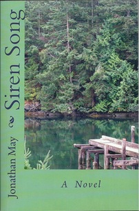
My new cover photo is one I took myself of the Black Warrior down at the old Lock Six Park, an area not unlike where my invented Magnum House was sits. I like the reeds in the foreground, the green tree overhanging (but not too green), the river flowing, the limestone bluff topped with trees across the river, and blue sky with clouds above. The colors permitted me to use a silver background (and yes, I did try other colors to make sure this was best). I also am pleased that the back cover text is much more readable against the silver than the green. To me the colors suggested by the novel are silver, gray, and brown with hints of gold and green.
CreateSpace allows a fairly wide choice of cover format, and for my fiction I particularly liked the one I chose for this novel and “A Howling in the Night.” They look quite different but suggest a continuity. I used a very different format for my two more personal memoirs, wrap-around photos with front and back text in lighter boxes, and I chose to use photos I took of details from old buildings. (You can see what those other covers look like on my Amazon author page: https://www.amazon.com/Jonathan-May/e/B00D8DG88O/ref=sr_ntt_srch_lnk_1?qid=1473342779&sr=1-1)
Basically those are my reasons for reutrning to the novel for what is likely to be the final time (although time, as indicated in the work, can kick you in the behind sometimes). Of course, it seemed wise not only to make the changes I wanted but also to re-edit carefully the whole thing. I did make a number of minor changes, but more to please me than to please the reader. I also decide I needed to simplify the back cover text, both the book description and the bio.
A funny thing about making changes. You are so delighted with your new and improved work that you can inject new errors. (Any of you other writers out there will know just what I mean.) And one of the best editors I know once advised me that any author is the worst editor for his or her own work. This is especially true for one as visually-challenged as I am. Everything looked fine in my Word document text. I sent it off electronically for conversion to PDF (which CreateSpace prefers). I checked the look of every page on the PDF when I downloaded: looked fine. The cover looked fine too, and I hit the “submit” button.
The next morning the electronic proof was available, and although I was able to see that the cover and the entire body of the work looked okay, I was not able to enlarge enough to proofread. I downloaded the PDF proof (which I could enlarge) and started spot-checking that. Of course I started with the opening paragraph (fine) and then jumped to the re-formatted poem. Looked great until I got down to the line “leaving the stars to shine more bright,” and it read, “leaving he stars. . .” That T was missing. A small goof, but it could not have been in a worse place. Talk about sore thumb!
I thought I knew the answer, but I did email CreatSpace with the query: since e I had only 1 typo, could they simply correct for me or did I have to go through the whole process of re-doing PDF and re-submitting everything. The answer came back: I had to do it. Anticipating such, I had already got things moving in that direction.
Knowing I could not enlarge back cover sufficiently to proof that text, I had immediately ordered a single proof copy. I decided to await receipt and examination of that before resubmitting files. It arrived the Tuesday after Labor Day, and as soon as I checked the cover, I did re-submit the whole thing. And now that I had the cover approved and accepted, I could move along to publish for Kindle.
Kindle could proceed with the PDF copy, I believe, but they prefer resubmission of the original (well, the re-edited) Word document. Within a short time after I submitted that on the Wednesday after Labor Day, a proof copy was available of how it would look on Kindle. I paged through to make sure there were no glaring format problems, and discovering none I hit the “publish” button. It was immediately available in the Kindle store and by the next morning was available on Amazon. By that time the paperback was available in the CreateSpace store but would not be available on Amazon until several days later.
Pricing: As usual, I set the price for the paperback at $12.95, pennies more than Amazon’s minimum price for a work of that many pages. I set U.S. price for the Kindle edition at $2.99. (I’m a great believer that the cost of electronic format books should be lower than at least half that of the hardcopy edition.) I enrolled it in the Kindle Unlimited program, for a limited time available at no charge to subscribers to that Amazon program at $9.99 per month: I will get monthly royalties from that month’s KU income based on how many persons read it in Kindle format and the number of pages each one reads. I also enrolled it in the Matchbook program: any purchaser of the hardcopy can then get the Kindle edition at the reduced rate of $0.99. (Amazon cleverly converts price for copies sold in foreign countries to the appropriate currency.)
If a Good Fairy showed up to wave a magic wand and grant me one more wish for the look of the published product, what would I choose? That’s easy: suppress the page number until page 11, the first page of the actual text of the novel. Word 2013 claims that such is possible and gives detailed instructions on breaking the work into 2 parts and start numbering where you wish. I have struggled and struggled, many hours of such, and it simple does not work for me. My copy of Word? Inherent in the whole thing? I have had to settle for omitting the numbering on the very first physical page and permitting them to show beginning with “2” on the verso. At least positioning the number at the bottom of the page and centered under a line seems to make it less noticeable. (If I were using a “real” publisher they would handle such nuisance problems. They know how and have the wherewithal. I don’t)
For those of you who have the earlier edition, I see no reason for you to delve into the newer one. You can look inside the book on Amazon to see my new opening if you are interested. And I will post Anne’s poem at the end of this essay in its new format.
For those of you who have not read “Siren Song,” a word of warning. It is not a work for every taste. And if you are bothered by complicated sexual content, this is not the book for you.
What’s next writingwise? Get back to a collection of novellas and short stories I am working on called, tentatively, “Apocalypses.”
Anne’s poem with simpler format:
Moving calmly through her j*e*w*e*l*e*d realm
She looks down at the SUN!
of her Son . . .
lying palely in her glow,
the Gold of his day lessened by the loss of light.
She descends to take (Him)
in her embrace,
leaving the stars to shine more bright
in the Absence
of the Moon . . .
 RSS Feed